But anyway, remember when our vanity looked like this?Or for those of you who might be new here...take a look at what our vanity looked like before.
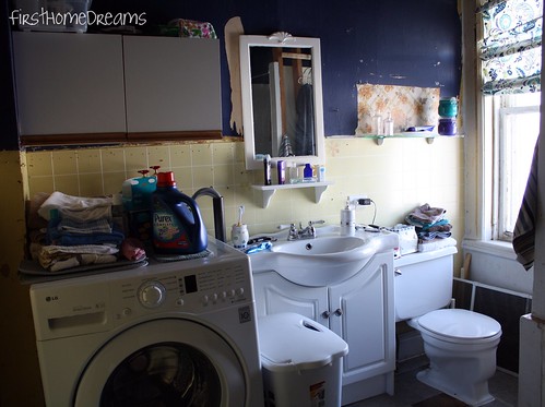
Gross.
Well, I hope you think what we did is an improvement - I really, really do!
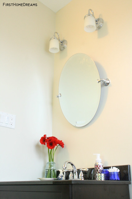

The wall colour, as I mentioned back here, is Vintage from Sarah Richardson's Designer Palette by Para Paints.
Gerber daisies are my favourite, and I couldn't resist these vibrant red beauties staring at me at the grocery store.


The chintz dish was my Granny's, and it's a perfect catch-all for earrings and tweezers. The mini Delft pitcher is just wee and cute - it came from the same auction as my $5 chairs (which I received the fabric for - yay!). And I just can't get enough of vintage mason jars. Trendy schmendy.
A friend of mine got me hooked on Bath and Body Works candles, and when I was in there today scoping out their new scents, I noticed that they make these neat holders for their pump soaps (which also smell amazing).
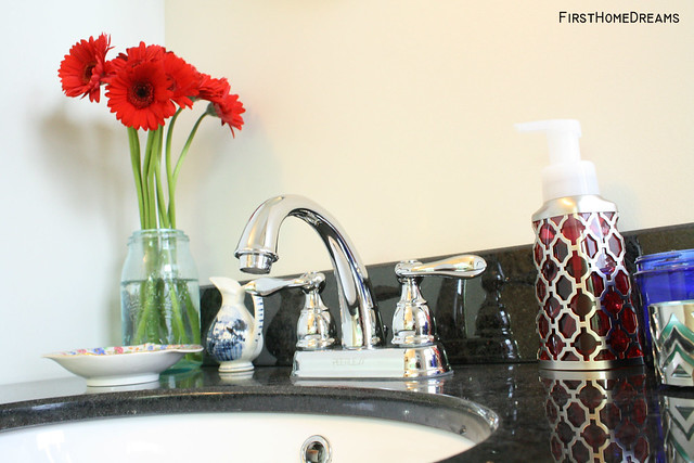

I grabbed a bunch of stuff while I was in - like the little candle and holder that you can see at the far right, above - and the total was less than the price of another soap dispenser that I had my eye on at Home Sense. Hoorah.
The faucet is Peerless, and came from Home Depot for only around $65. The cobalt jars came from the Barrie Antiques Center for just $2 each, and they're perfect for corralling cotton pads and Q-tips.
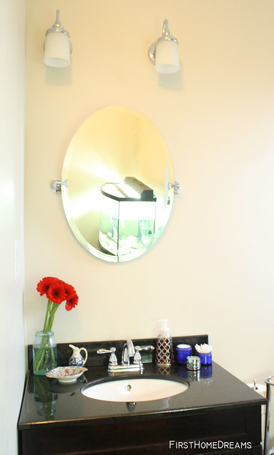

I talked about the sconces back here, the mirror back here, and the vanity here.
The vanity got dressed up with some inexpensive pulls from Lowes. I didn't like the knobs that came in the box, but didn't really want to spend a lot. I wanted pulls rather than knobs, and these $3 pewter guys were perfect.

Moving forward...I've started working on the cafe curtains but I probably won't share those until we get our new windows in. And speaking of windows...we got a quote, and it's ugly. If you take a look at the exterior of our house, you'll notice that all of our windows have rounded tops. Knowing that, we decided to get two quotes - one for a regular square window which would have to be topped off with aluminum to make up the gap where the brick is arched, and one for a round top window that would fit like a glove. The price difference is significant. A round top window is nearly three times the price. But, we decided to bite the bullet and go with the round top window. The only reason we can do this is because we're just doing the one window right now. If we were doing every window at once? It wouldn't have even been a discussion. But, thankfully we have a choice because of how we're doing our renovation. I hated the idea of choosing the cheaper window just because it was cheaper, and regretting the choice every time I looked at it.
How about one last look at the vanity?


Dare I ask for thoughts?
Psssst! I'm linking this post up to these parties!
 |
 |
 |
 |
 |
Did you like this post? Click here to subscribe and be notified of new posts. You can also find me on Twitter, Facebook, and Pinterest.

No comments:
Post a Comment
Waaaaaait! If you're reading this, it means you're viewing First Home Dreams from a mobile device. If you comment here, it won't show up on the regular site. Click "View web version" (below) and comment from there with Intense Debate.
Thanks!